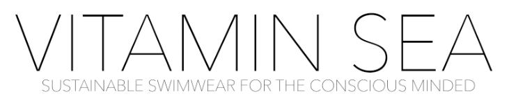
Looking back this was my favourite of the talks that we had as I think it is the bit I find the most interesting, designing the logo. Although, I have to admit that I did struggle at first to come up with a range of different brand names as I decided on one that I really liked very quickly a the beginning. The name that I came up with was ‘Vitamin Sea’ this is a saying that people in my target audience (18-30 years) use regularly when referring to the need/want to be beside the seaside and on holiday. It is something that I think is a recognisable saying and is a more fun name than some of the other ideas that I had. These other ideas were ‘Conscious Swim’ and ‘Conscious Swimwear’. I felt like these were too literal about what I was selling and lacked the fun element that ‘Vitamin Sea’ had.
I then went on to looking at the typography. I was pretty certain straight away that I wanted a white background with black slim, classy text, although I did want to explore down the route of colour. I had a play with creating the letters for ‘SEA’ out of using different sized circles around a colour scheme that I thought was appropriate for what I was selling and also incorporated the ideas that I did have to appeal to a female audience.
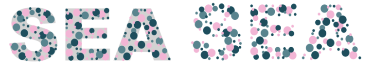
I used the outline of Ariel Black, heavy, to use as a guide for the letters. Then with a dark turquoise, light turquoise and a baby pink I added in different sized circles building up the shape of the word ‘sea’. Although I think that this looks amazing and is really eye catching, I wanted a more luxury looking logo with a plainer text that was extremely easy to read.